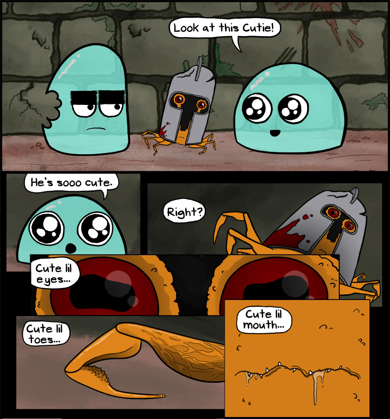
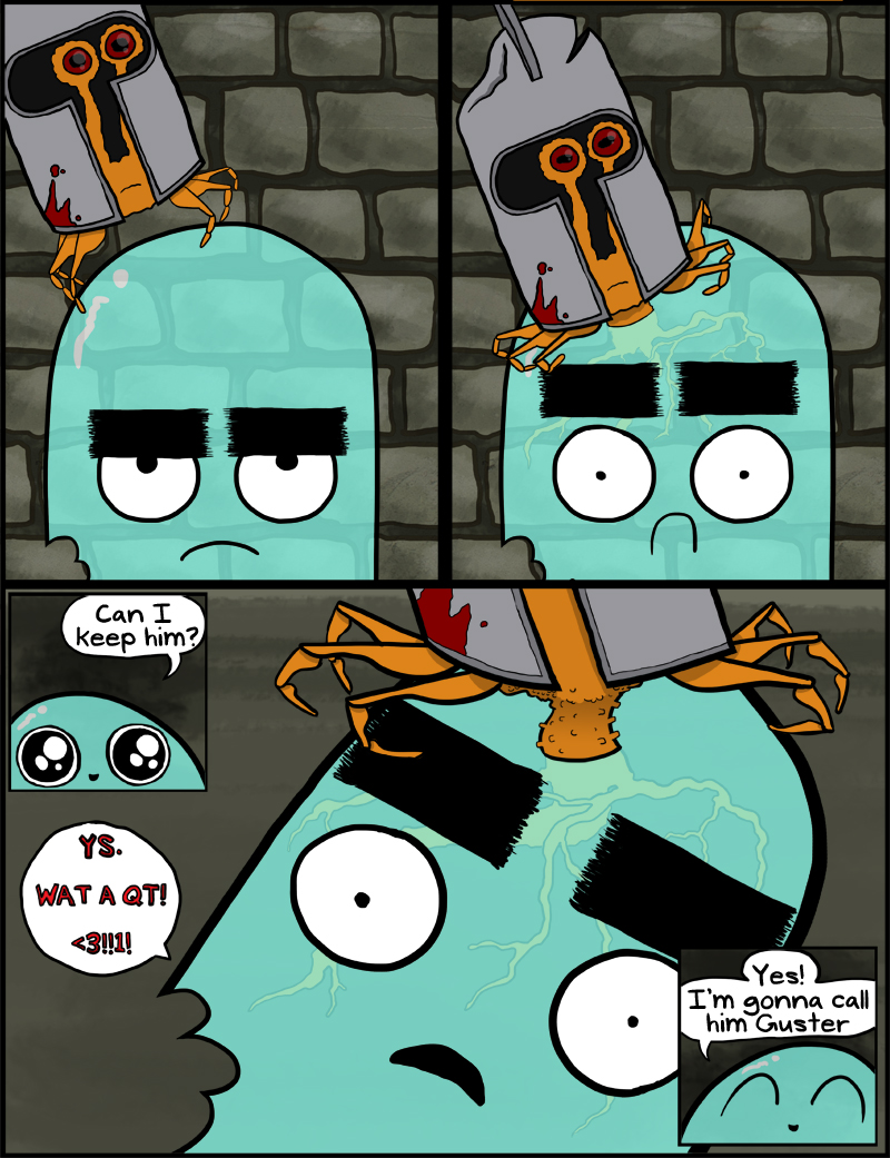
I am really proud with how this comic turned out, especially the art. It was a total beast to churn out because of all the unique panels and overlapping things and such. I had a total of 37 layers (not including text layers) which is kind of ridiculous.
One thing I wish I’d been doing sooner was cutting out the dead airspace. The wide panels that I’ve been using this whole time have so much unused space above their heads, so I just cut it out. And I think it looks dandy.
Another thing I tried was doing shading with the laso tool and the gradient tool (seen in the Guster close ups, particularly the toes) which I saw done on this comic coloring video on youtube. I’m pretty happy with the results, and I think it keeps up the cartoony vibe.
And just so all y’all know, this is the first in a series–the next one goes up Friday.


