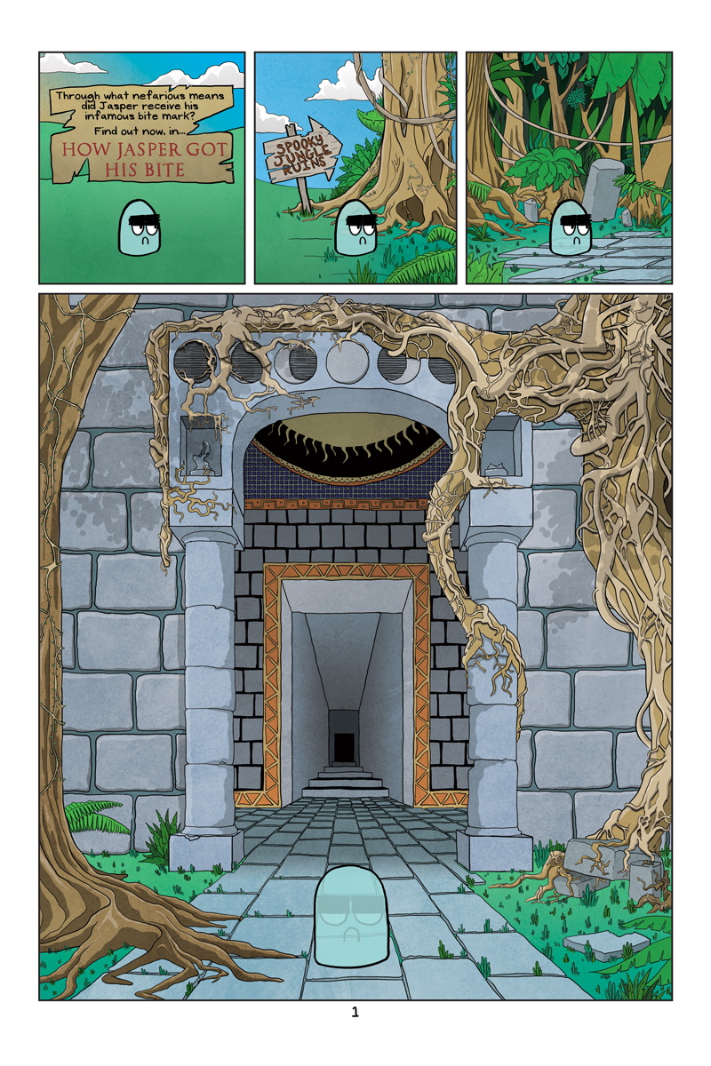
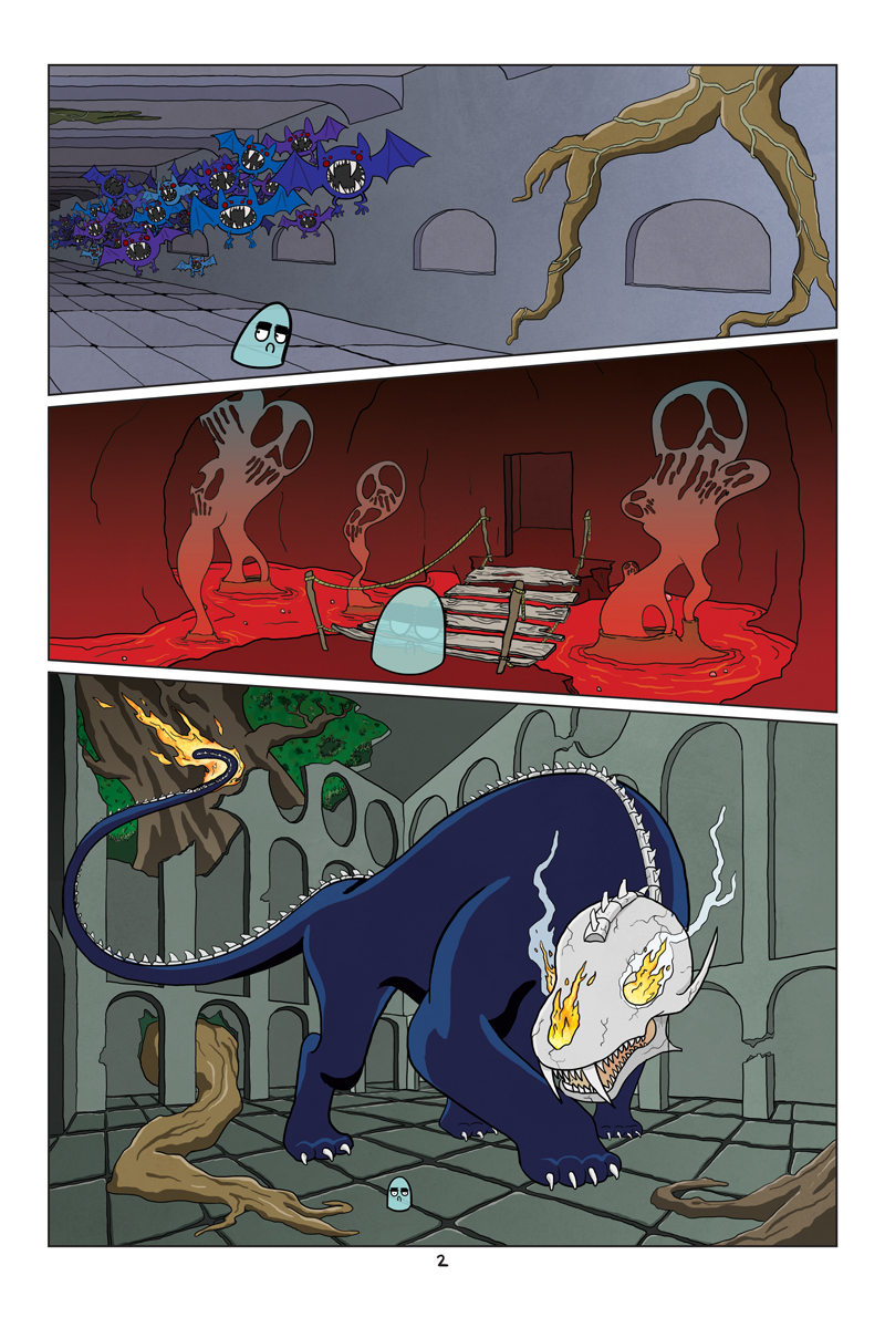
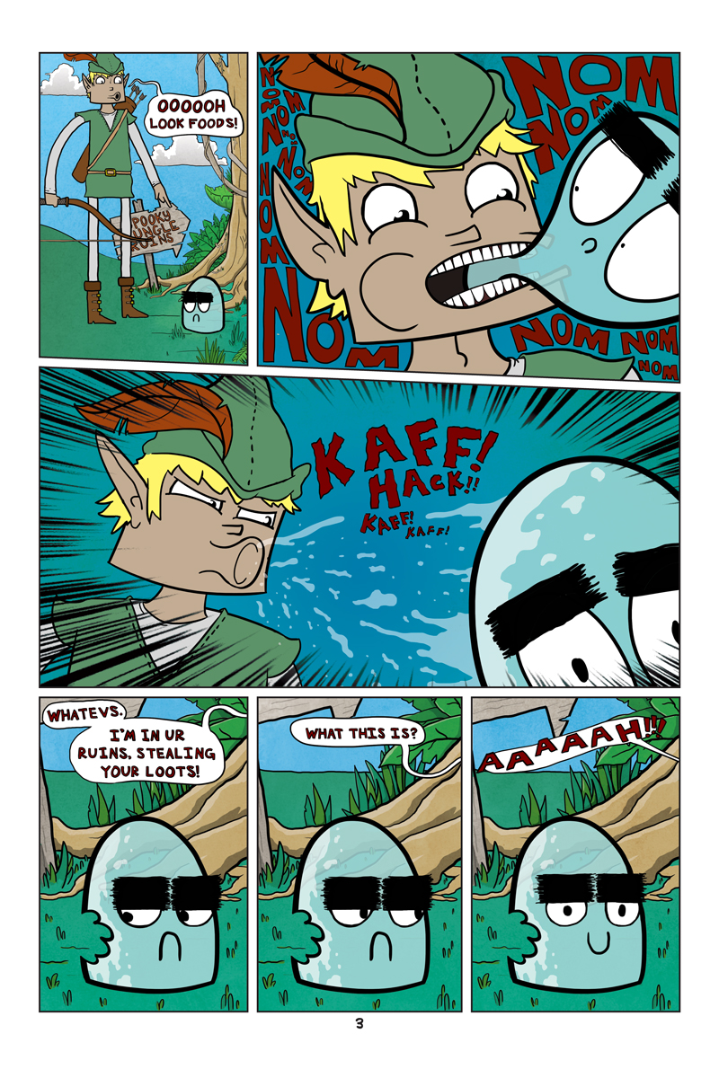
First off, sorry. This comic (on top of trying to create a new website) nearly killed me. So much time was sunk into this bad boy, it went past the one week mark. But it’s three pages, so that totally makes up for it. Plus look at how detailed it is! I almost like it more in it’s black and white state:
I know I spent a good ten hours on those inks trying to do as much detail as possible, channeling a sort of sloppier Geof Darrow type style. I wish I had given myself more time to spend on color, because I could have added just as much detail at that stage — alas, I knew I had to cut it off at some point.
Once again I spent way too much time on the art, and not enough on the writing.
The gag here was supposed to be him going through dangerous jungle ruins, with tons of dangerous thingies, all of which would lead the reader to think, is this the dangerous thingy that will give Jasper his bite. Fighting those expectations, he would emerge untouched, only for the whole thing to be undercut by some lightweight archer lad doing the deed. It doesn’t work. But hey, it’s pretty right?


6 Comments
I gotta favorite this internet site it seems handy handy
I am impressed with this site, very I am a fan .
It was a little confusing because the exit to the spooky jungle ruins looks exactly the same as the entrance (which is intentional, to get adventurers killed, right?) but as far as the joke goes, it worked great for me and that’s some awesome artistry right there, sir.
In the comic, I would argue that the ruins loops around in a circle, spitting you back to where you started.
In real life, twas much easier to reuse a background instead of drawing a new one.
The last three panels have a very Raven from Teen Titans GO! style to them.
all those dangerous monsters and he got his bite on an idiotic adventurer? HAHAHAHAHA