Skip to content

Mimi

Mimi published on No Comments on Mimi

I’m pretty happy with how this one turned out. Thanks to Eric E. again for helping me figure out some panel placement and simplifying my original plan.

Also wanted to say, I’m enjoying playing more with gradients and colors to help distinguish panels and locations.  It really helps to set things apart.  My only gripe is that I didn’t redraw the chest in the bottom left panel so that the line quality would match the rest, but it was late and I was tired.

Oh and I’m really excited that this is my 25th comic.  Looking at the difference between this comic and my first, the contrast is pretty drastic.  I’ve learned a lot doing this and I intend to continue on learning.  Thank you all for your support so far!

Stats Card

Stats Card published on No Comments on Stats Card

Nice and short one for this week’s Dungeon Crawler Comic.  I feel like I need to use the words Dungeon Crawler comic down in these descriptions more often so that when someone searches Dungeon Crawler Comic on Google, it’ll be a higher result.  That being said I have no idea if this actually works.

I made a huge effort to make that power card something that could actually be found in a Dungeons and Dragons manual.  I’d say the item is usable, but VASTLY overpowered and all around a bit silly.  Still though…

Look at that face, what do you see?

Look at that face, what do you see? published on 5 Comments on Look at that face, what do you see?

I wanted this comic to be one of those gross close up gags that you’d find in Ren and Stimpy or Spongebob, and while it’s almost there, I feel like it was a little rushed.  It definitely lacks the same technique and polish, but it gets the job done.  Part of me thinks the comic would work better without the words on the second panel, but I think they accentuate the ick, so I stuck with it.  Until next week!

**EDIT**

Below is a high res version of the comic sans words, as requested by Grinning Noble.

Comic 21 large

Raiders of the Lost Something or Other

Raiders of the Lost Something or Other published on No Comments on Raiders of the Lost Something or Other

This comic took me longer than any other one so far, but it is easily the one I am most proud of so far.  I had the idea to riff on the opening scene of Indiana Jones and the Raiders of the Lost Ark, but I took it a step further and decided to take backgrounds from the actual film for the comic.  Below are the screencaps I took and what I did to them (and more discussion follows):

Keen eyes and photoshoppers will probably be able to see how this was done (as well as the mistakes), but to put it simply, it was a lot of copy, paste, clone tool, etc.  I had a lot of fun doing this part since I haven’t done photo-manipulation in a while now.

Also, look at the shading on Jasper and Bo (and Guster).  It’s all gradienty and ish.  I felt it was in keeping with the more realistic tone of this comic.  Oh and check it, I used a white border this time simply because the black blended in too much to the frames.  Exciting, right?

Until next week…

Super Powerful Guardian Guy

Super Powerful Guardian Guy published on No Comments on Super Powerful Guardian Guy

I actually finished this one by Monday, since I was so excited to draw it.  Again, this was with the pencil tool and lots of redrawing, as opposed to reusing panels.  I think that’s something that makes making this comic more fun, is the actual drawing of it.  This sounds silly, I know, but what I mean is that there’s a lot more minutia that I have to focus on in order to make things work.  Whether it’s drawing the background, making sure the inking is on the right layer so it’ll show up behind or inside the blobs, coloring, word balloons, etc, it’s never quite as fun as the actual drawing.

All right, now here comes some kind of dense comic theory type stuff, so you can cut out if that doesn’t interest you:

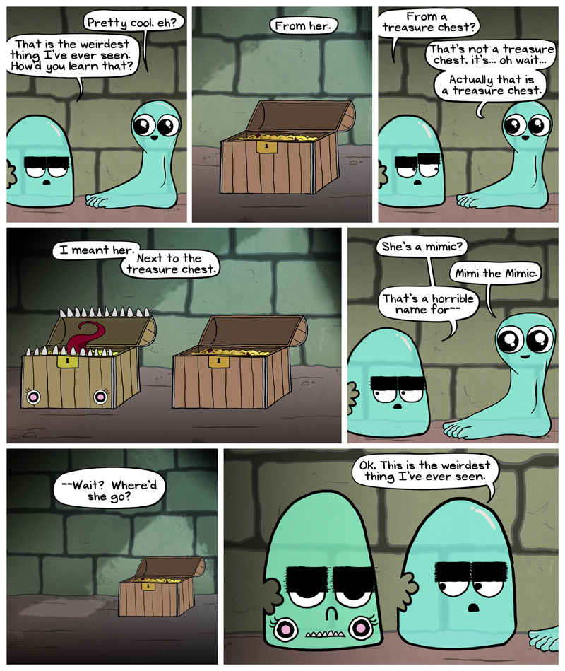
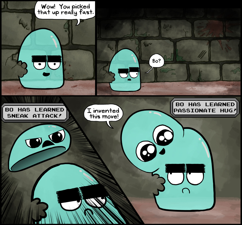
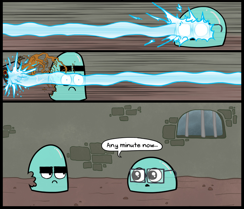
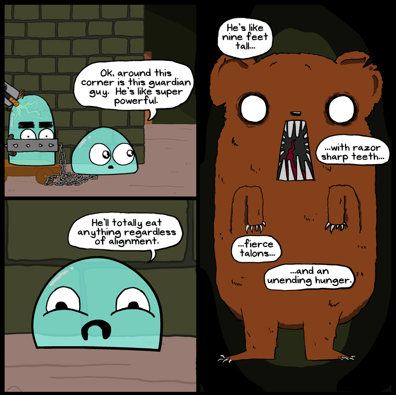
I want to talk about the first three panel make up.  Readers should always read left to right, then top to bottom, just like they would in a book.  This is made easiest when the panels line up in an orderly fashion (like the lower panels).  The top three are confusing, because the reader doesn’t know if they should go to the right panel first, or to the lower panel first.  I did this on purpose to create a sense of circling as the reader tries to navigate it, spending more time on those panels, when in all reality I wrote them to be read in either order.  In retrospect, I don’t think I would do it again unless I had a better story or thematic reason to do so.

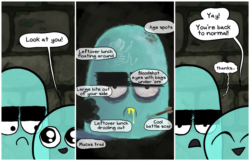
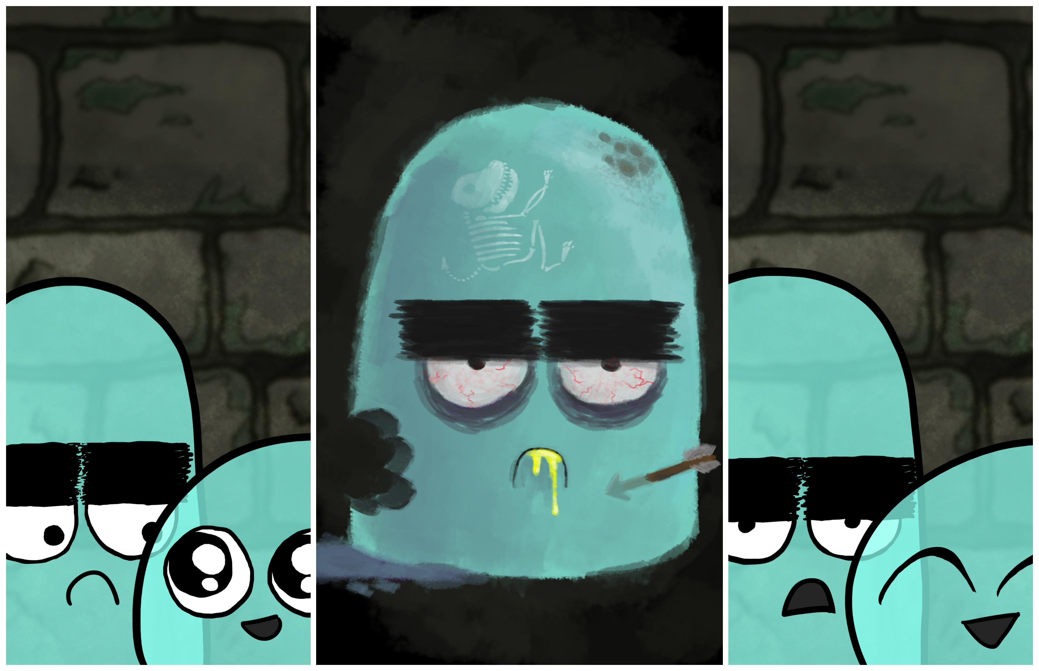
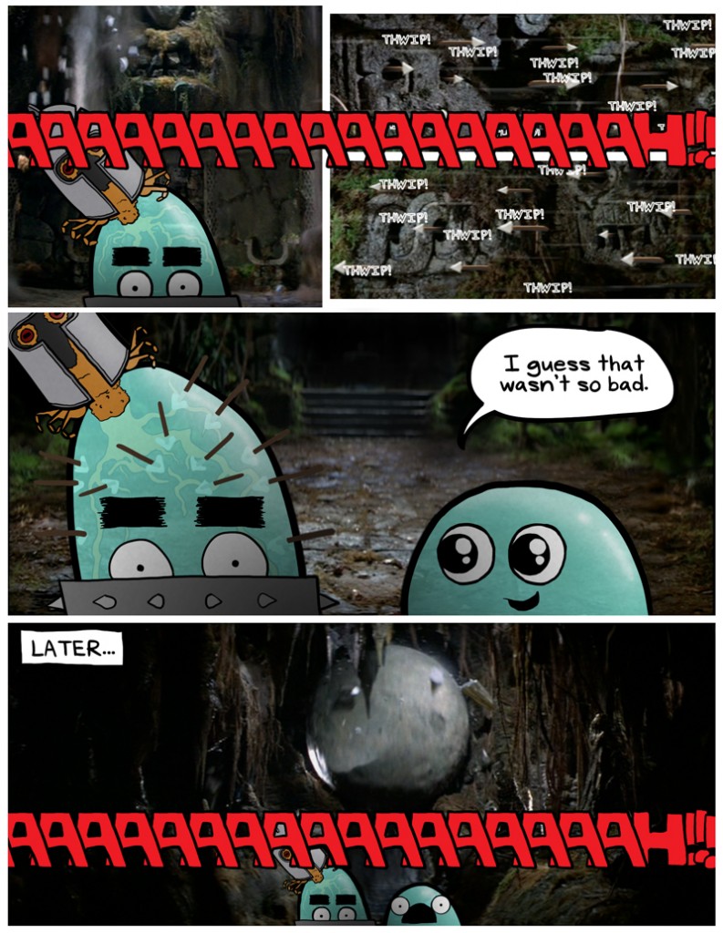
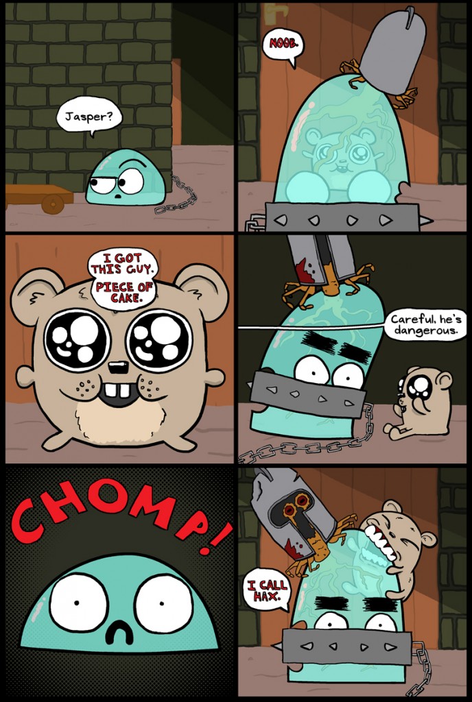
I also want to talk about using the uniform square panels repeating.  After doing the panels as such for this comic, I’m not sure I like them.  Their uniform nature does tend to make the eye wander, again leaving it curious which direction to go next (though certainly not to the same degree as the upper panels).  I think this level of uniformity would be good for lists.  What I mean by this is a series of a variety of objects or different states of a specific object, thus making the focus not on linear storytelling, but on what the key differences (or similarities) the object/s have in common.  Sorry, that last sentence was a doozy.  Frank Miller’s Sin City: The Hard Goodbye does this when listing off the weapons he picked up, with each panel having a simple object and a description, nothing more, and it works brilliantly.  I really feel like the innate squareness is a key factor here–if nine rectangular panels were repeated I’m not sure the effect would be the same–but maybe it’s just me.

The Journey

The Journey published on No Comments on The Journey

This time I went with an entirely new process, by using the pencil tool, instead of the brush tool.  Let me show you what I mean:


If you look closely at the pencil tool, there is a sharp edge with one tone, whereas the brush looks softer because it very slightly fades into the white behind it.  This is basically the difference between alias (pencil) and anti-aliased (brush).  Drawing the backgrounds without outlines became easier, and it made the bucket tool easier to use.  The finished product doesn’t look hugely different, simply because it is re-sized from over 3000 pixels wide to 800.

I kind of like the cartoony background since it fits in with the style, but I do love how the painted backgrounds (like I usually do) contrast and make the subjects really pop.  Not sure how I’ll do the next one, I need to weigh the pros and cons.

Wheely Thingy

Wheely Thingy published on No Comments on Wheely Thingy

This comic was a stretch to get done before Friday.  I’ve been working on a lot of different projects lately (some really exciting stuff), and so writing Dungeon Crawlers got put on the back burner.  I sketched out the idea for this one at lunch yesterday and then drew it up on the computer later in the evening.

The thing that was the biggest struggle was that I had the images I wanted in order to progress the story, but I didn’t know what the dialogue would be.  I had no real punchline.

I woke up early this morning and started writing like a mad man, trying to come up with ideas that wouldn’t require me to redraw the entire comic.  I’m not unhappy with the results.  No, I am not mad at that.

A special thanks to my wife for waiting for me this morning as I typed and drew like a madman.  She got the car started and cleaned off the snow and all that so we’d be ready to go as soon as I could send the image to myself.  She is awesome.